Be the change
Understand how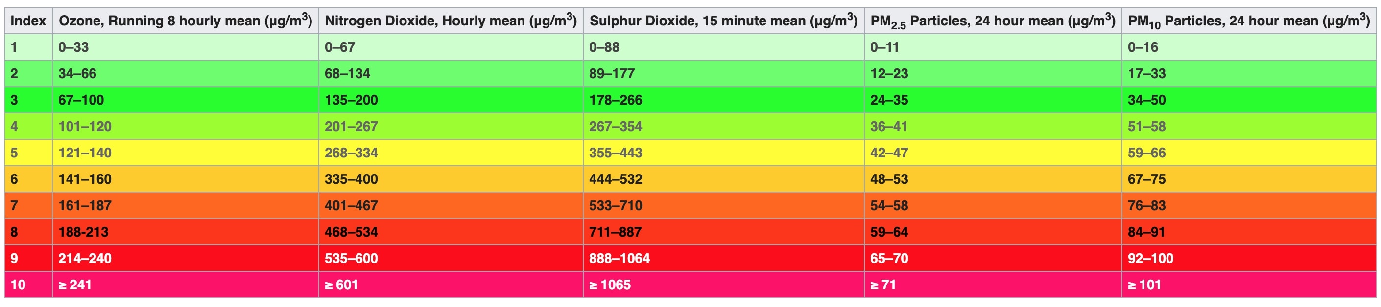
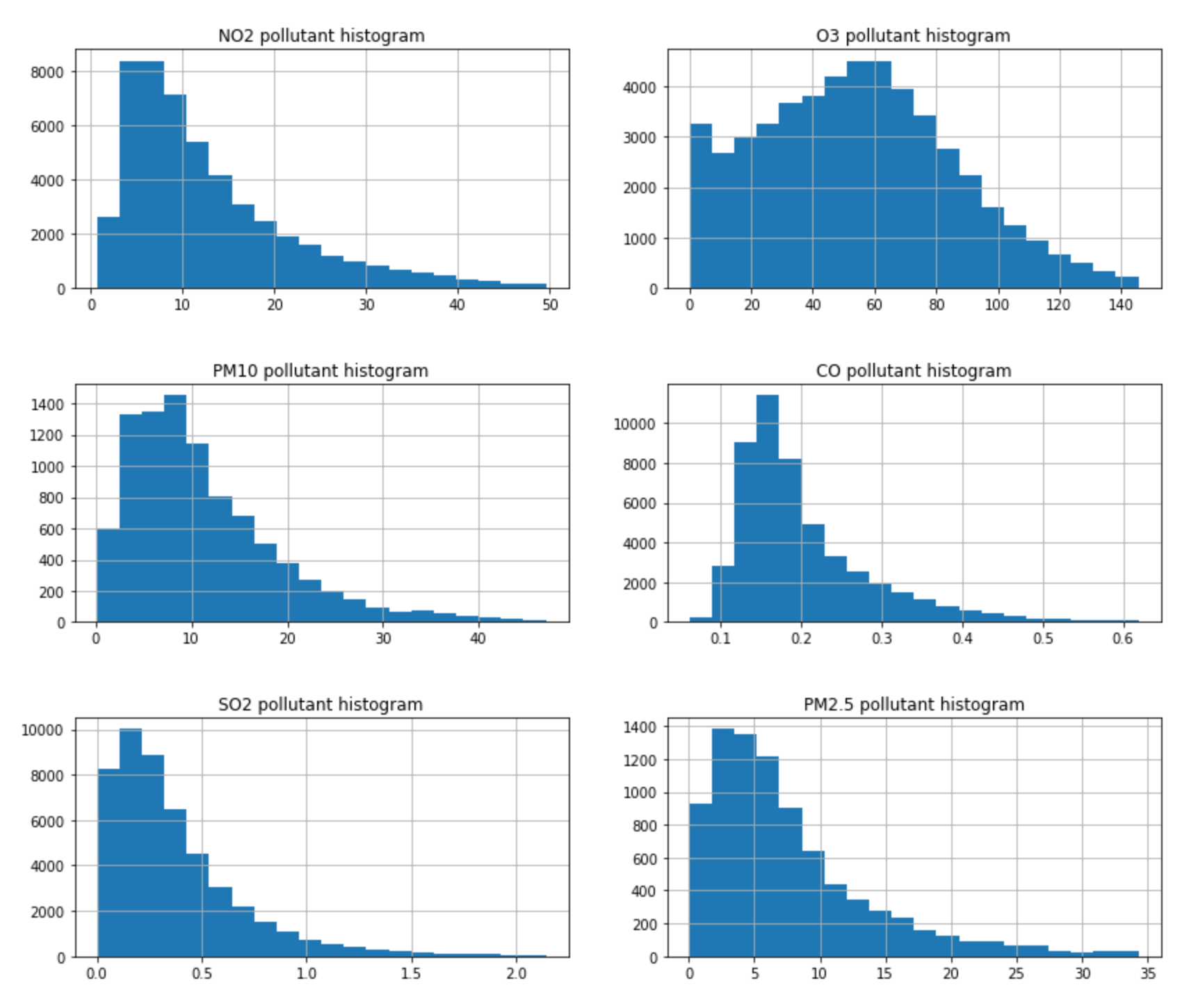
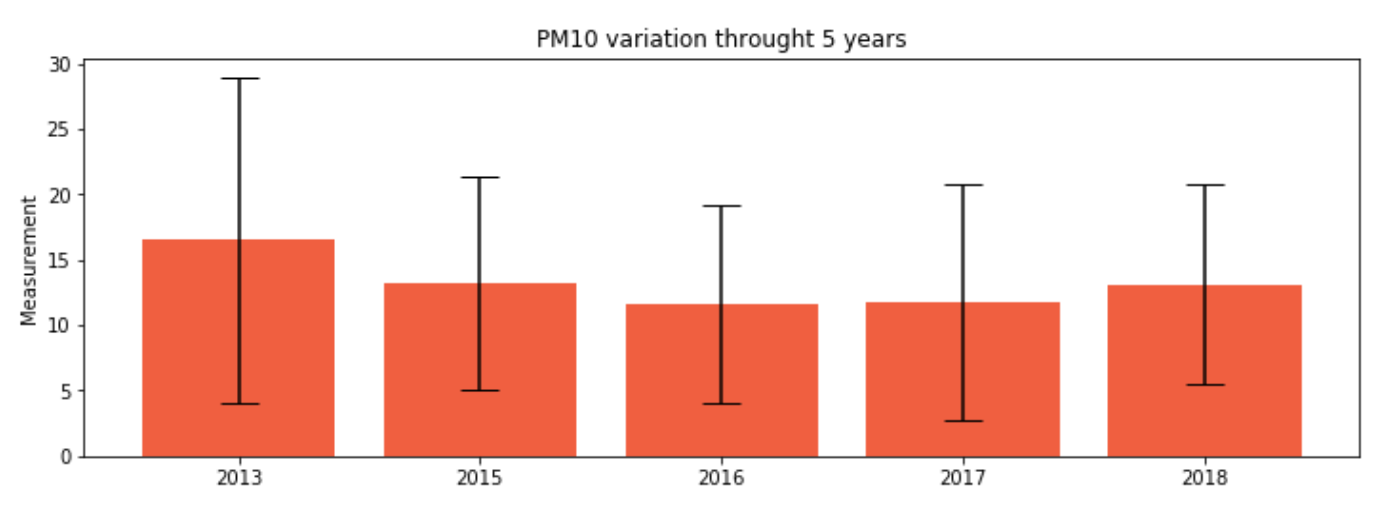
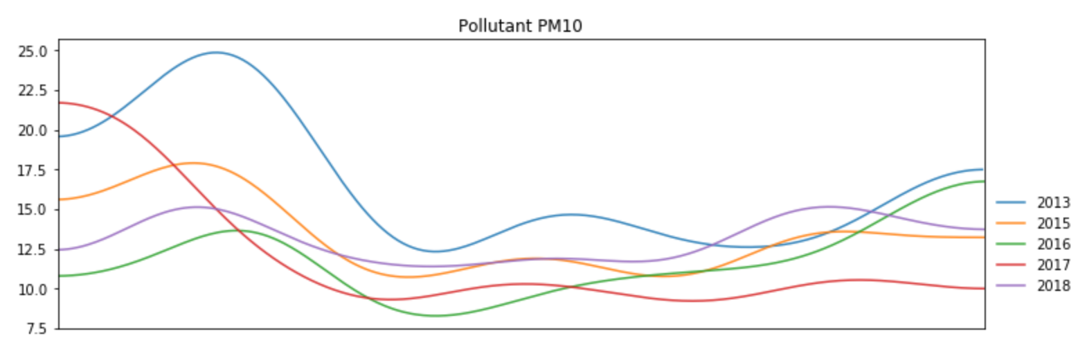
PM10
By analyzing the distribution of pollutants value along with the reference of what each value means we got the the following conclusions:
The majority of the time PM10 (particulate matter of 10 micrometers or less in diameter) are at healthy reasons, toward the lower end, thus not putting at risk outdoor activities. To reiterate, this particles are produced from a wide range of industrial processes through bulk material handling, combustion and minerals processing (brickworks, refineries, cement works, iron and steel making, quarrying, and fossil fuel power plants).
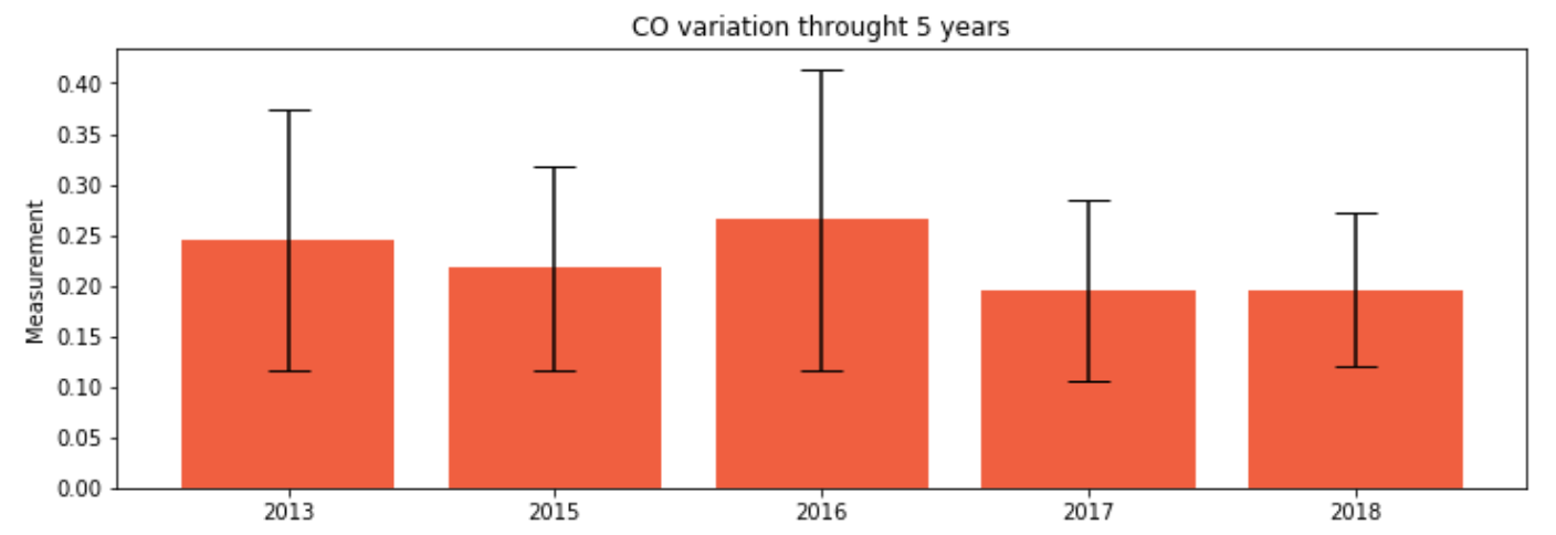
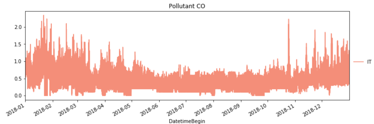
The natural concentration of carbon monoxide in air is around 0.2 parts per million (ppm), this amount is not harmful to humans and the presence of this value is strongly reflected in the histogram. Even levels of 0.5 ppm represent the maximum allowable concentration for continuous exposure for healthy adults in any eight-hour period. Only from 2.0 ppm levels effects like slight headache, fatigue, dizziness, and nausea can appear after two to three hours of continuous exposure.
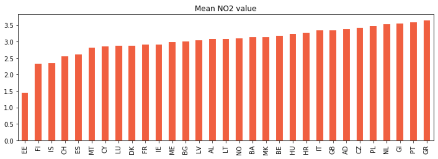
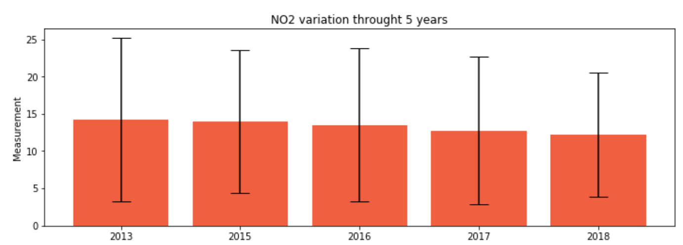
The NO2 levels are exceptionally good as the whole distribution of values is framed into the lowest air pollution category.
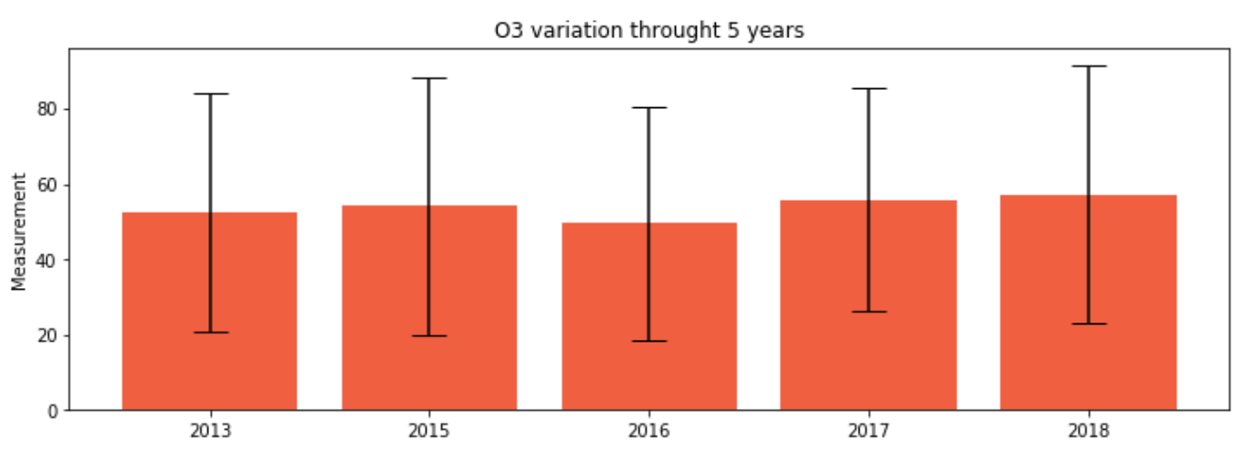
The distribution peak is at 60 which is situated towards the superior range of low pollution levels. The majority of the levels are situated in the range of 0-100 which is still considered to be healthy, only exceptionally the values will spike to moderate pollution levels.
We had to double-check for the values to be in the same scale as the
Even though the measurements for this pollutant are sparser than the others we can still see the histogram depict the distribution to being between the lower indexes of air pollution (higher indexes are worse).
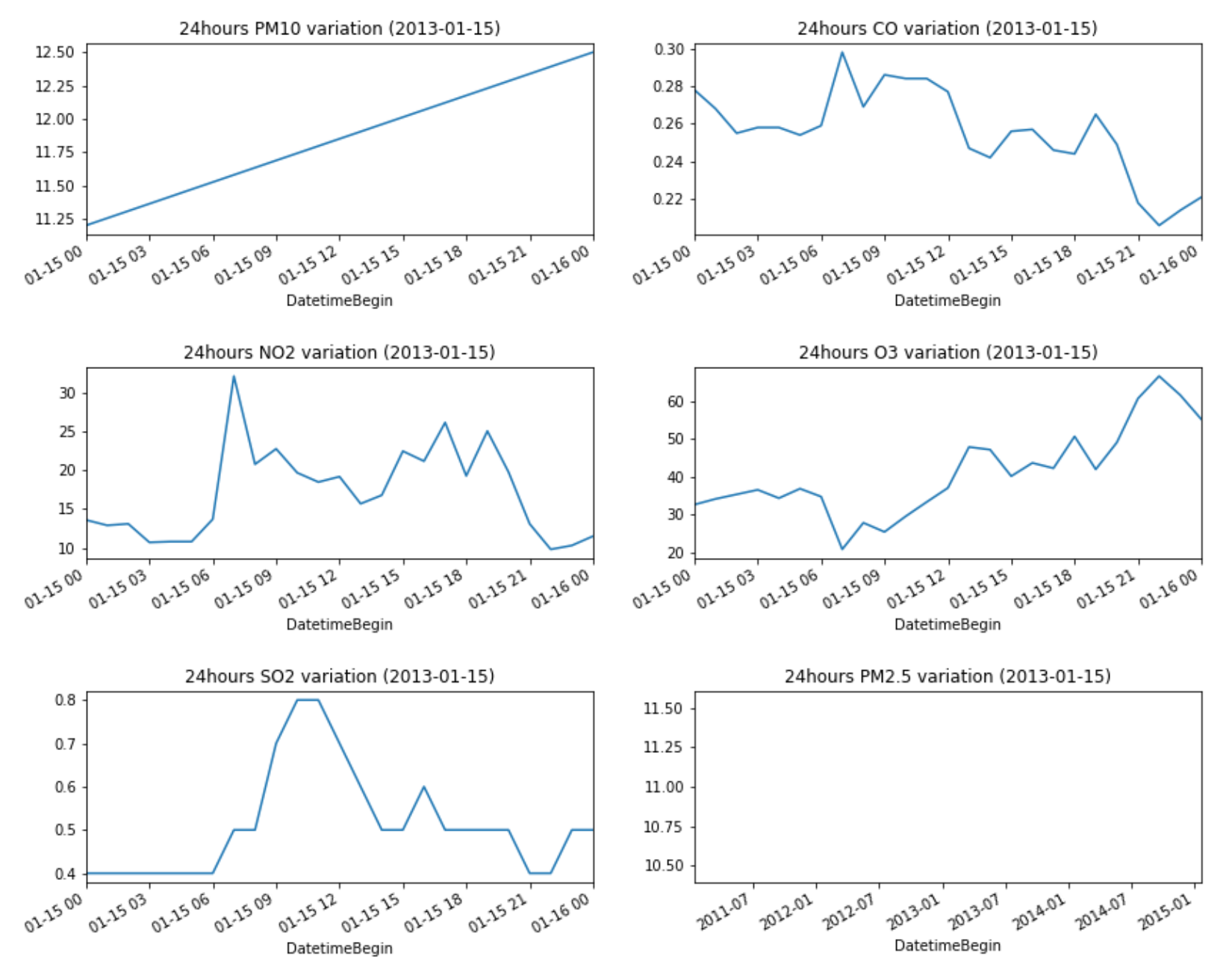
Let's first only take a look at what happens during 24 hrs (random day chosen to be 2013-01-15). Can we see some patterns? ... indeed certain polutant spike at certain times of day
PM10 value is monotonically increasing because of a lower densities in values (we only have ~1 or 2 measurements per day). PM2.5 is even sparser, thus we cannot analyze it.
CO and NO2 values peak early in the morning , O3 peaks around 10PM and SO2 during launch
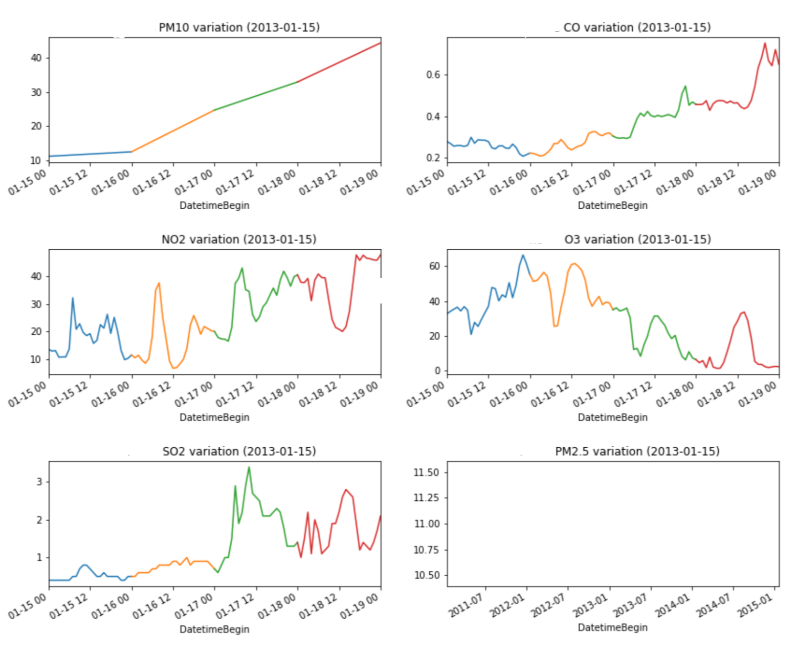
Indeed we can not draw a conclusion over the the variation pattern by only looking at a certain day, so let's extend this by looking at a 96hours variation. Each day is rendered in a separate color.
It appears that PM10 is on an increasing streak (during this selected time interval). The above identified patterns for CO, NO2 and O3 still hold over several days (even though the values are on a longer term increasing/decreasing tendency).
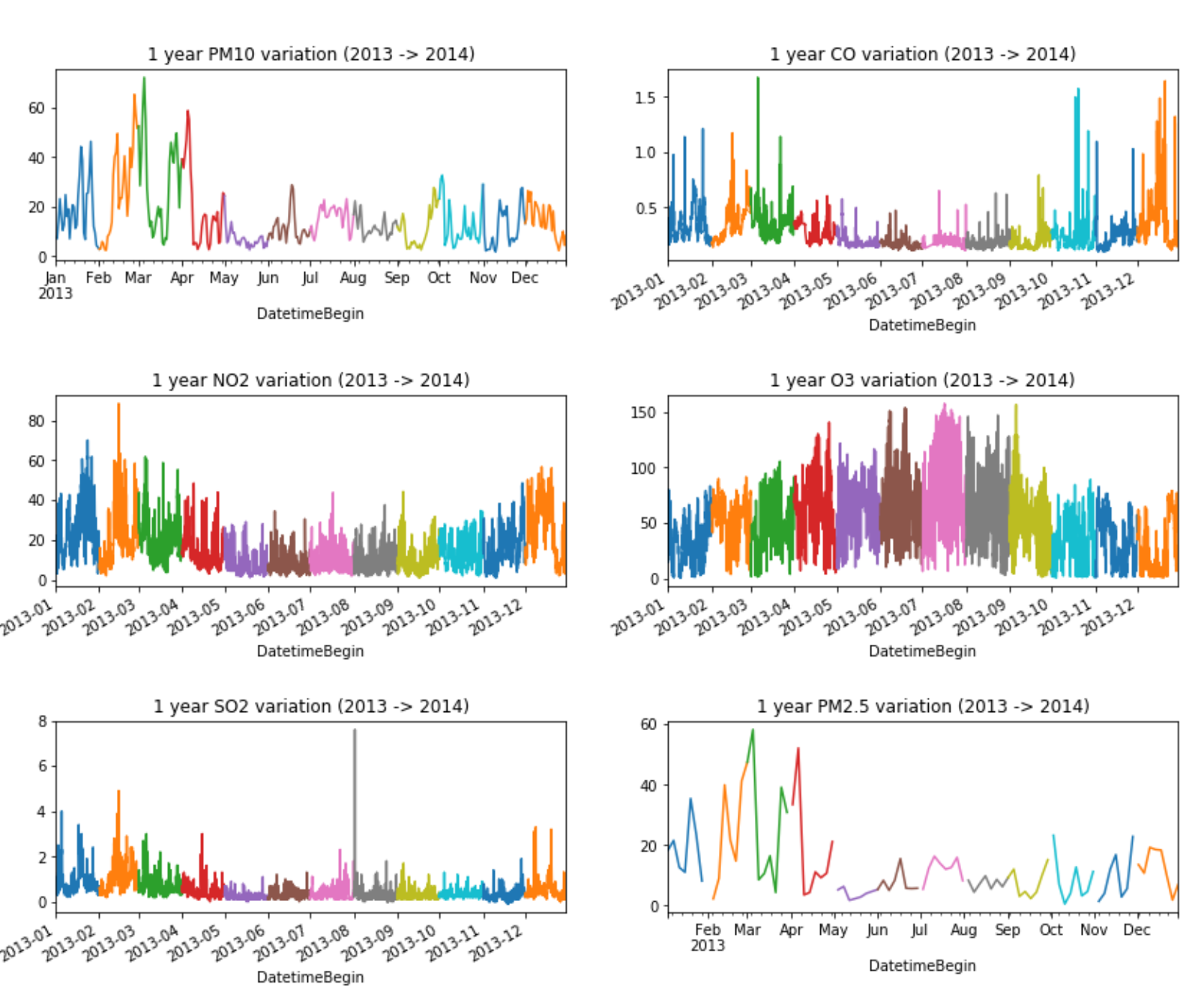
Now let's go even further and analyse a whole year. Each month is rendered with a different color.
One of the most obvious patterns is the increase Ozone levels during summer
As the weather heats up during the summer months, ground-level ozone pollution increases as pollutants react to heat and sunlight. Ozone levels often increase with summer wildfires, further worsening the air quality and ozone-related breathing issues.
ps: we are still only in Switzerland at this point
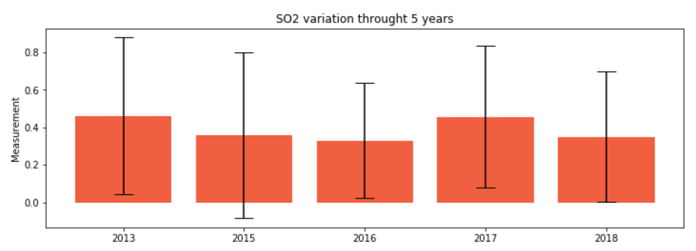
Our dataset contains entries between 2013 and 2019. Switzerland 2014 data was missing so in the end we choose to analyze the years 2013, 2015, 2016, 2017, 2018.
Before drawing any final conclusions, let's look at the above data in a different way
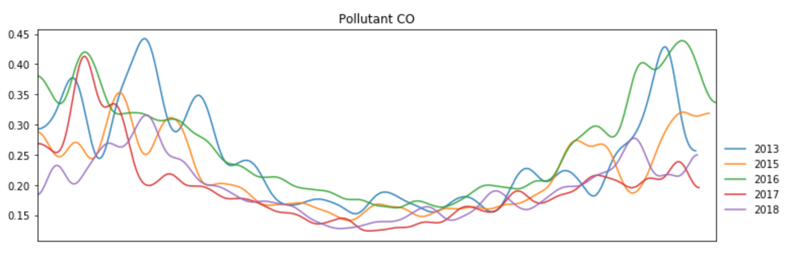
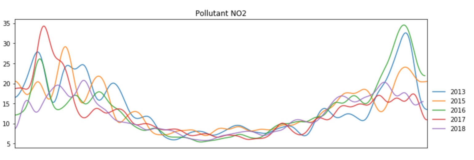
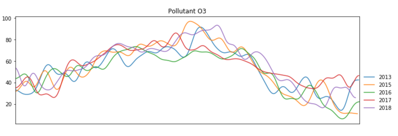
Besides NO2 values which slowly trends downards, during a period of 6 years we cannot conclude that there is a specific decreasing or increasing trends in pollutants values. It is certainly a positive aspect that these pollutants stay more or less at the same levels in Switzerland (levels which are considered healthy), that shows us that we are definitely in a good spot regarding pollution and we are able to keep this performance throught the years.
Future work we considered: digging for historical data (over 10 / 20 / 30 years) that could show a bigger picture
The above charts confirmed the fact that pollutant values are affected by the seasons, that's why we can see :
According to the Italian press, Italy is the first in Europe by the number of victims of ozone and nitrogen dioxide in 2019. Looking at our map of NO2 and O3 indicators, we observe that Italy does occupy one of the leading positions
in the pollution of this substance, especially in 2015-2017. Source: https://valori.it/italia-record-morti-smog/
Nevertheless, we can consider Germany as a positive
example because the level of NO2 pollution in this country is gradually decreasing every year. This is also confirmed by the German press: the actions taken by the German Federal Environment Agency are working: the level of nitrogen
dioxide was too high in 57 cities in 2018, and it is 8 cities fewer than a year before. We see a similar picture on the map we implemented. Source: https://www.tagesschau.de/inland/diesel-abgase-staedte-101.html
According
to our analysis, the most unpolluted countries are France, Sweden and Finland. Considering all of the values, these countries spent most of the time in the "yellow zone", that is, for example, the CO values did not exceed 250 mg
per m3. Our results are confirmed by the British press. Source: https://www.greenmatch.co.uk/blog/2018/11/mapped-europes-most-and-least-polluted-countries
Despite
the fact that the legal threshold for SO2 and PM10 in Turkey is much higher than that of WHO (World Health Organization), it is one of the most polluted countries in terms of SO2 in our analysis. Turkish scientists have conducted
many studies explaining the relationship between SO2 air pollution and mortality. Source: https://academic.oup.com/eurpub/article/27/suppl_3/ckx189.020/4556805
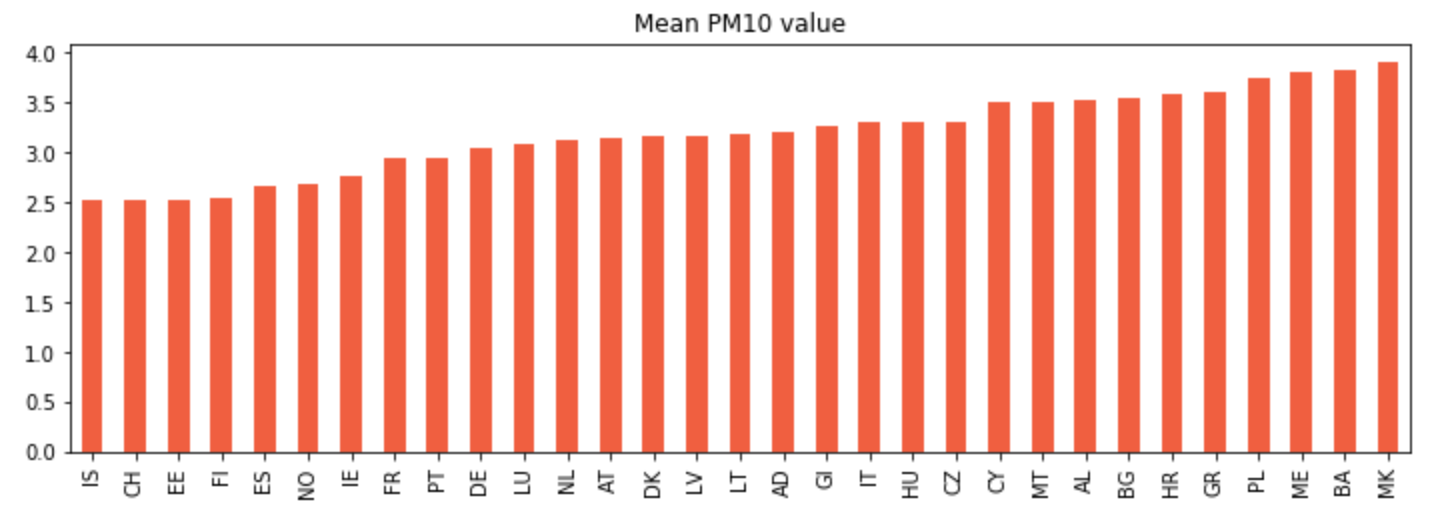
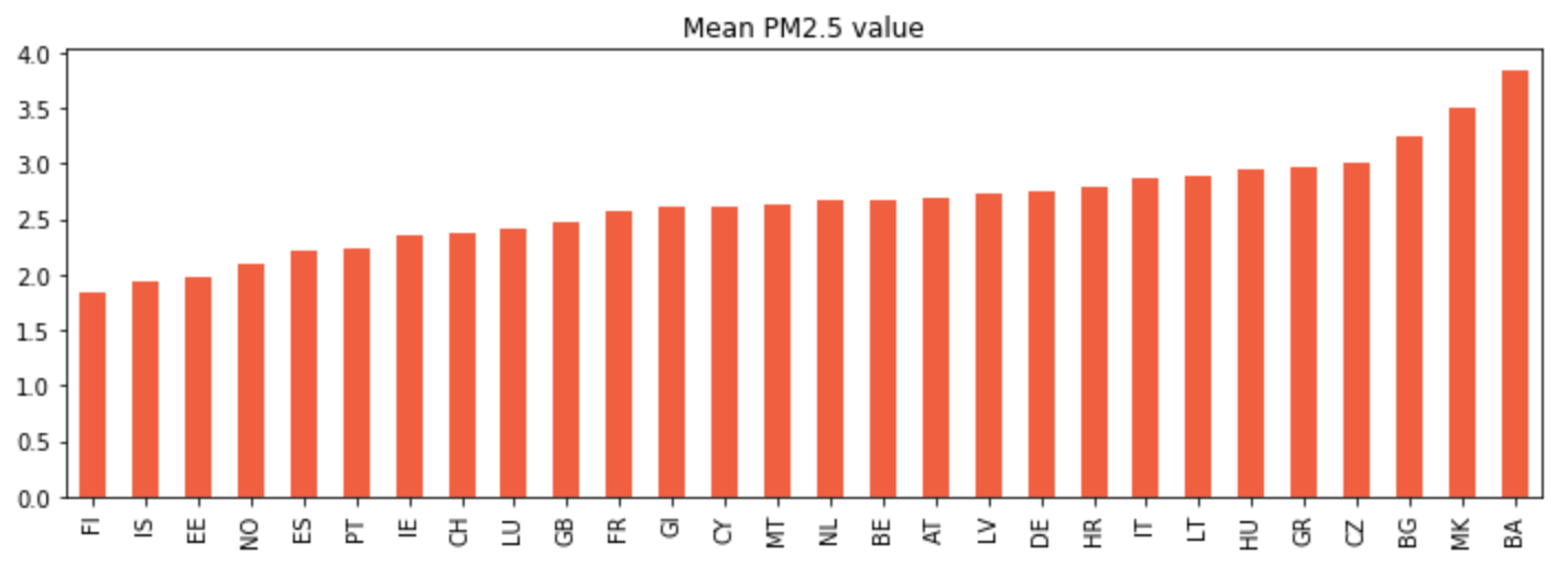
However,
the most polluted countries are the countries of the Balkan region. If we look at the maps we implemented, then, for example, the PM2.5 value exceeded 80 mg per m3 for Kosovo and Northern Macedonia in 2017, and the PM10 value for
Montenegro and Northern Macedonia was even more than 90 mg per m3 in 2015 and 2017! This is also shown by new data from the World Health Organization for 2019. Source: https://balkangreenenergynews.com/balkan-region-maintaining-record-high-air-pollution-doesnt-tackle-main-sources/
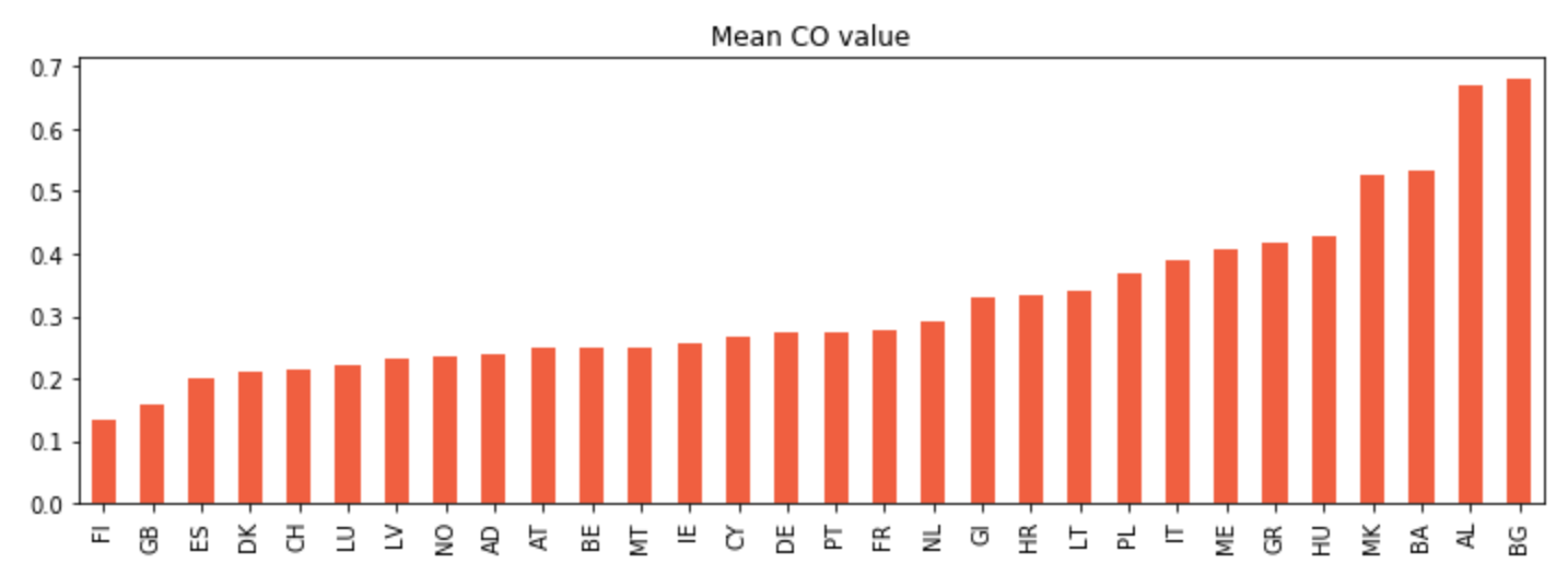
We can see that Bulgaria is at the top of the chart. In order to validate the assumption that forest fires were the cause of this result, we are going to try to pin-pointing with the following chart the exact moments when some hypothetical fires could have offsetted the results.
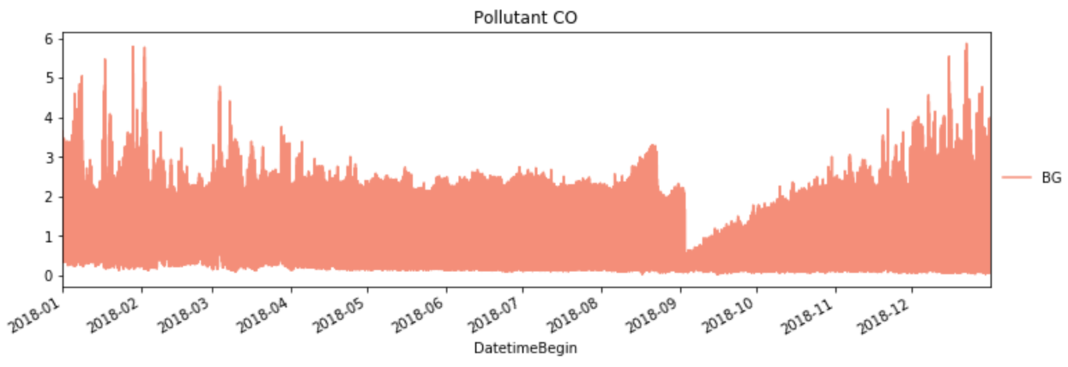
Interestingly but we do not see any spikes during summer / early autumn when fires usually appear. Let's look further more at Italy, the country with the most forest fires in Europe (in 2018 there were 147 fires, 14 649 ha burned)
Again, during the period in which forest fires are frequent we do not see any considerable spike. The only noticeble pattern we are seeing in both Italy and Bulgaria is the increased concentration of CO during winter ("the outdoor CO concentration in winter was 2.80 and 1.4 times higher than in fall and spring, respectively" taken from Atmospheric Pollution Research article)
After plotting the graphs with pollutants levels for the different countries, we’ve also noticed and supposed that they are very similar for some countries. But what if the pollutants levels are not only similar but also dependent
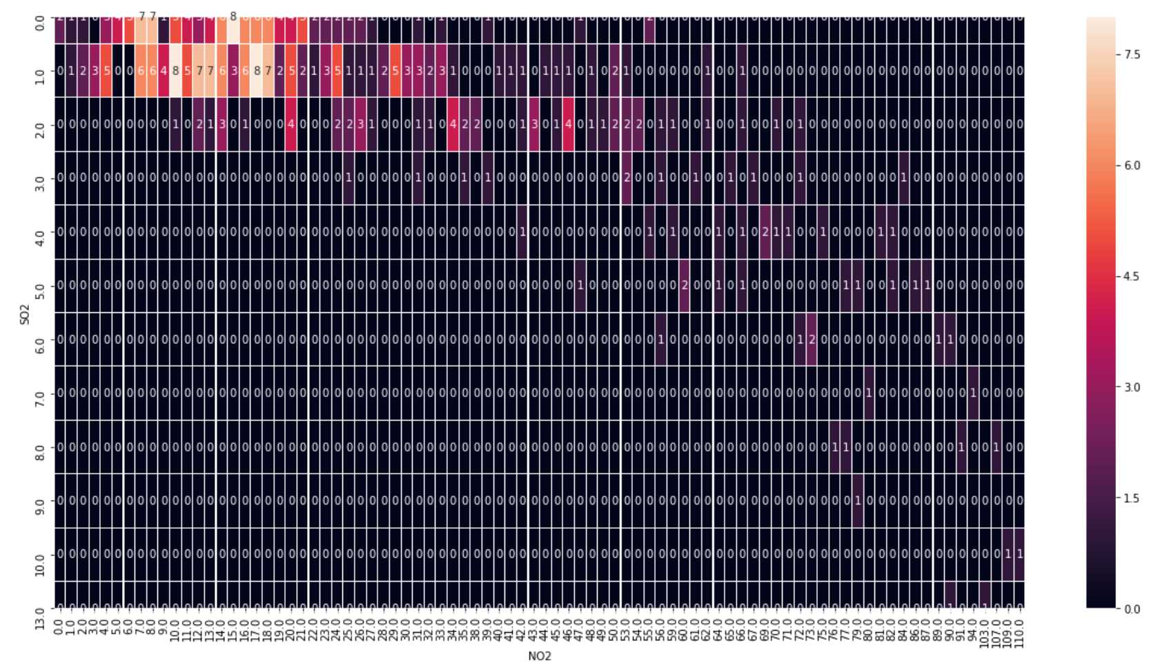
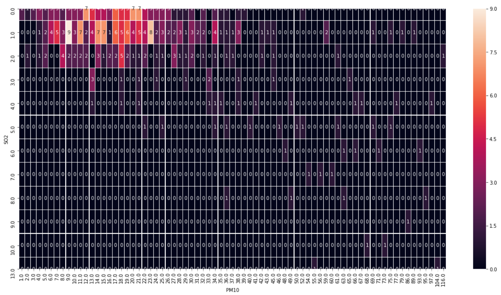
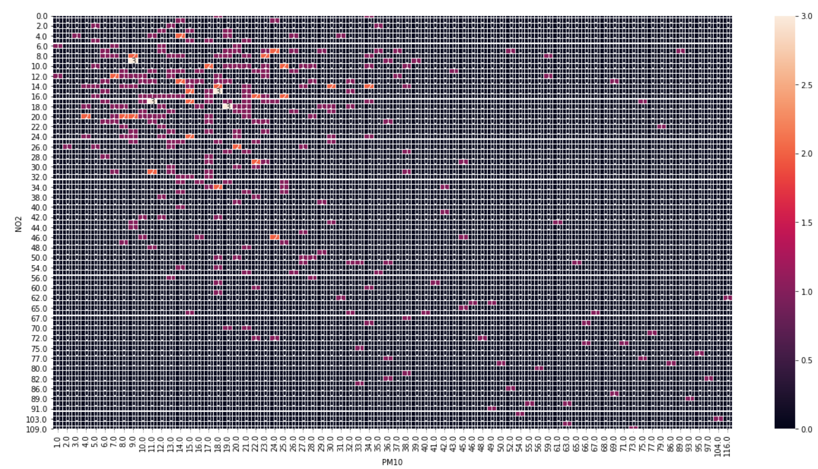
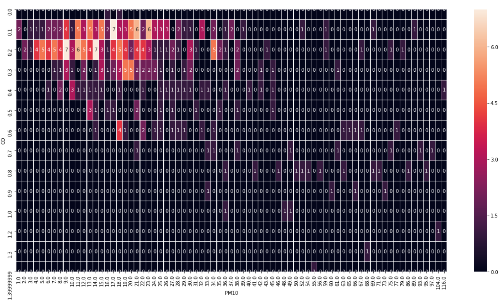
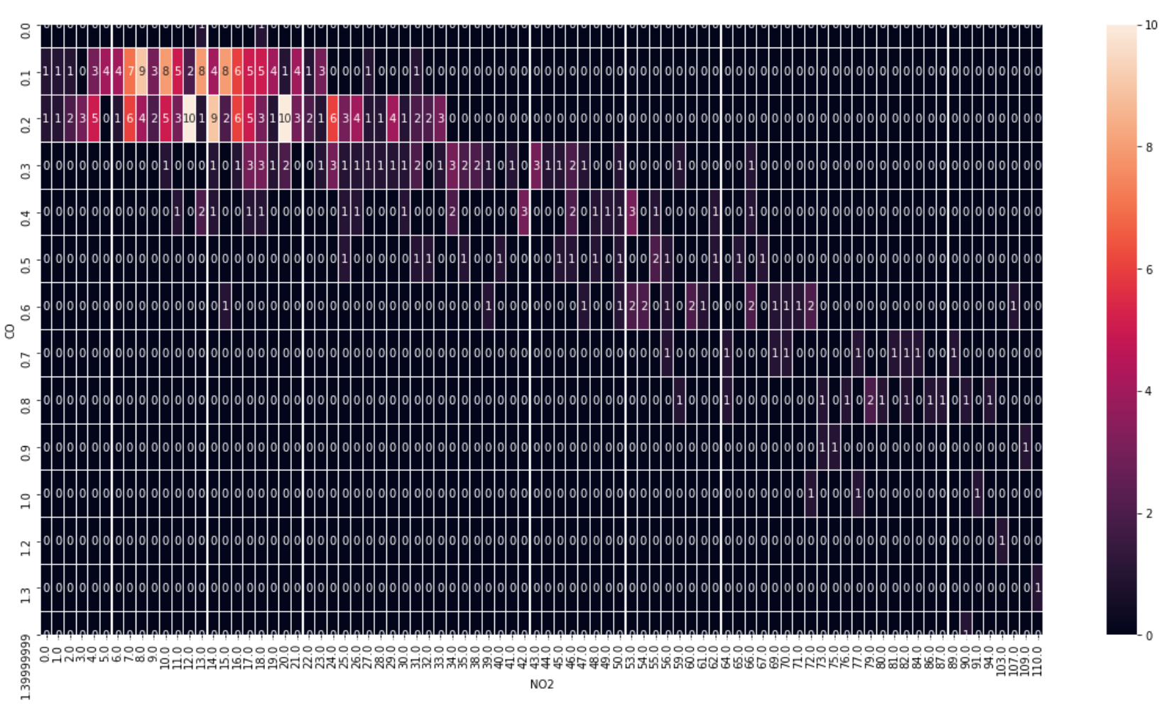
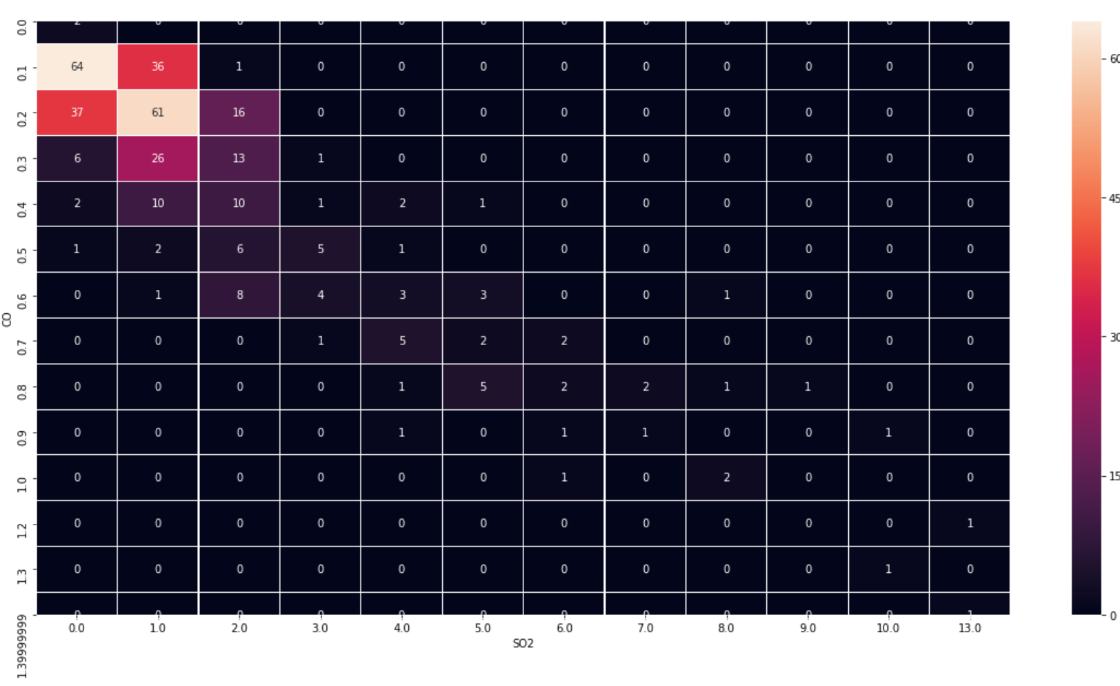
on each other? That’s why we decided to plot the confusion matrices for the pairs of two main pollutants we picked for the previous part.
As the arrays length for each pollutant are the same for Andorra, we decided to check
the dependence on this country.
With CO, NO2, SO2 and PM10 we received 6 pairs of pollutants to check them out. The results are pretty straight forward. For the pair CO and SO2 we found that there're the highest
values on the diagonal of the heatmap plotted based on the confusion matrix, which shows the number of the repetitions of certain points. We can also check that the plots for these pollutants variation looks very similar. They're
indeed proportional with a certain coefficient and very dependent on each other. When we got this dependence, we decided to check the nature of this kind of the pollution to be sure about our results. We found out that both CO
and SO2 are the main fuel combustion products. They both are extracted as a result of the chemical reactions on the manufactures, as a product of coal burning in the thermal power plants. The increase of the CO and SO2 concentration
also caused by world fuel consumption by cars growth. Here we have a proof that these two pollutants are indeed dependent on each other. So, the government of the country with a high level of CO and SO2 needs to solve this problem
to decrease simultaneously the levels of both pollutants.
The other pairs of the pollutants are not as similar as the first two, but some kind of dependence exists since the values of the confusion matrices are
non-zero.